Be Styled

We know all-white rooms can be great, but it’s time to embrace your dark side. Deep, dark color schemes can give a room weight and depth. It is embracing, it’s relaxing and surprisingly it’s not gloomy at all but instead creates a calming atmosphere perfect for bedrooms.

Think of deep plums, forest green’s, dark navy’s and charcoal grey’s on the walls and strong dark floor boards or thick dark carpets to create a sophisticated bedroom retreat. Everything depends on the décor you create. Even dark spaces can pop up and   look very inviting when done right.

How to decorate moody bedrooms


Choose any style you like as moody and dark colours are classics and will go with any style: glam, modern, art deco, minimalist, contemporary, vintage and many others. Moody spaces aren’t just about black; deep green, purple, graphite, burgundy and so on can all be moody, just pick a ecopayz deep, rich tone.

Your moody room can be refreshed with some softer colours to create that gorgeous balance of masculine and feminine. Metals such as brass, bronze, chrome and gold beautifully accent dark colours. Pair these with really strong finishes like loop pile carpet, a dark plush carpet with a cut pile or dark toned timber floors and you’ll end up with a gorgeous sleep sanctuary that you’ll just never want to leave!
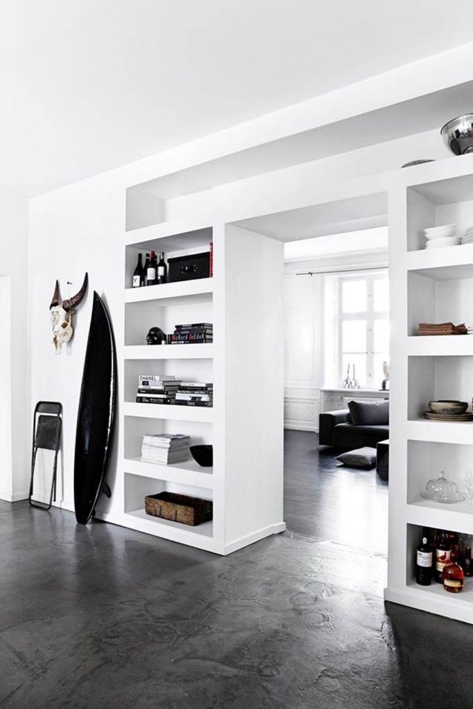
Flooring picks


As mentioned above, in a moody  room you want to continue this feeling on the floor. Dark timber floors or thick pile carpets provide the perfect grounding for this look and add that layering effect of warmth, peace and restfulness. The darker colours absorb and cocoon you from the outside world.

Here are our favourite flooring picks for moody spaces:

Malmo Florence 'Romito' colour swatch
Florence Romito
Rhino New Orleans Bourbon Street
New Orleans Bourbon Street
Untamed Chic Dwelling Place
Eligna Newcastle Oak Dark
Intenso Chevy Oak
Rhino EverCore Herringbone Tortoise Shell
EverCore Tortoise Shell

Find more moody flooring here and moody bedroom inspiration on our Pinterest Board here.

Be Styled

Incorporating old world with current style you reuse your collected, and often priceless antique pieces, in a setting that gives them new life.

Do you have one (or many) vintage possessions, (maybe sentimental, maybe not) that you have guiltily hidden away in a cupboard or attic wishing that you could display in your home but have no idea how? It can be hard to display these beautiful items in a stylish way and to give them a purpose in a room. Nostalgic Charm style is about showcasing these items and giving them a new life in your home.


Nostalgic Charm is about celebrating important mementos and pieces
It creates a ‘whimsical’ history look without being over pretty
It has strong elements of colour which are often mixed with texture and patterns.

Flooring: SmartStrand Calhoun, Wolf Creek

Why would you pick Nostalgic Charm?

  • You have collected a lot of things over time that you’re ready to put on display.
  • You’re a sentimental person who likes the feeling of being surrounded by important memories
  • You take pleasure in having important things around you and living with them

What does Nostalgic Charm look like?

  • Patterns Patterns Patterns! Think- Checks/florals/colour/stripes/thecasinoapps.com
  • Old world charm
  • Antiques mixed in with moderns- connect all your collection pieces together
  • Celebrates looking back- it creates the “OMG I remember that” moments!
  • A deep pile carpet would work well with this, you can use wooden flooring as well.

Flooring: Karndean, Knight Tile

Would this style suit you?
It suits older couples/families and those more provincial.

#antiques #flooring #flooring style #nostalgic charm #smartstrand #vintage

Be Floored

Flooring these days comes with all sorts of benefits – warmth, insulation, softness, durability, fade or stain resistance, and more. It can be the foundation of a decorating plan, inspiring other ideas. Or, it can be selected to complement existing walls and furnishings. Above all, the flooring you choose should reflect your personality and bring comfort to your home.


When planning your “look”, it’s important to have a basic knowledge of how colour, texture, and pattern can work. Although there are no absolute “rules” that govern these considerations, we can help narrow down your choices with practical design and decorating advice.


The quickest facelift for any room is colour. It can be used to make a small room appear larger or to pull a background forward. It can create an atmosphere of warmth and comfort. Or, it can make your environment feel cool and spacious. However used, it’s colour that really creates the mood of your room. Start by gathering colours that catch your eye… fabrics, paint swatches or clippings from your favourite magazines or online inspiration boards.

We recommend you start with the floor and build your colours around the flooring. As you begin to research, you’ll find yourself drawn to certain shades that make you feel comfortable. It’s these colours that really define your personal style and make it your own.


To help determine your interior style, look at your favourite clothes, the artwork you love and your ultimate travel destinations – you’ll start to see a common thread.


Choose your flooring before selecting your paint, wallpaper and furnishings as the floor is the biggest investment and hardest and most expensive to change if you get it wrong.  The colours in your carpet or hard flooring can inspire the rest of our colour scheme.


When choosing flooring – treat the floor colour as the foundation of your palette. You can’t go wrong with natures tones which also create an atmosphere of quiet warmth: soft browns, greys, oak, ash and honey tones all work well with other hues.

When you want to achieve something that is not going to date and has a sense of timelessness – take inspiration from nature – either a natural grain running through the boards or laminate or if carpet use a covering that has more texture – try a loop pile there are some gorgeous examples of this around.


Use paler tints to lighten up a dark room. These soft, cool colours also help make a small room seem spacious. Mixing colours can provide a feeling of height. Use the darkest shade on the floor, the next shade on the walls, and the lightest shade on the ceiling.

If carpeting a small space keep the colour tonal to the room, slightly darker than the floor and take wall to wall – rugs or carpet squares in small spaces can make the space seem smaller as the eye reads the rug or square not the room as a whole. By keeping your colours tonal the effect is holistic it becomes the whole space not just identified areas of a part of that space.


And finally, be sure to colour test your flooring sample by daylight as well as by artificial light at night. Colour changes dramatically when flooded with sunlight or lit by lamps.

#design #flooring #flooring choices #floors #renovating #renovation

Be Floored

This handy guide will help you find beautiful flooring that suits your lifestyle, interior style and budget.

Considering new flooring but not sure where to start? It can be an overwhelming and stressful experience choosing flooring for your home. To carpet the lounge or go with hard flooring? Tiles in the bathroom or vinyl?

This handy guide will help you find beautiful flooring that suits your lifestyle, interior style and budget.

We’ve created 8 steps to help you choose the right flooring for you.

1. LIFESTYLE


Balance the look you like with the practicality you need. A lighter carpet may not be suited to a busy family but could work well in a quieter adult home. Although if you do really want to have a light coloured carpet in your home – our exclusive range of SmartStrand ‘rhino’ carpet will be the best option with it’s stain and fade resistant qualities.


2. TRAFFIC


Consider the activity at your place – are there lots of people, pets and kids? Entrances, stairs, hallways and ranch slider exits will get lots of use, so pick a product relevant to how busy your home is.


3. ENVIRONMENT 


New Zealand has a harsh sun environment, so consider the sunlight in your home and the level of durability and fade- resistance required of your floor. We also have eco-friendly and sustainable products available.


4. DECOR


Consider how often you like to change your design look. Choosing a more neutral floor will let you change out your furniture and colour scheme when it suits.

5. COLOUR 


Light affects the appearance of samples – so view them at different times of the day, in different rooms and against different furniture to get the best idea of what the full floor will look like.


6. BUDGET


Choosing the cheapest carpet doesn’t necessarily save you money in the long term, so invest accordingly to make sure it will last the distance you need it to.


7. UNDERLAY 


You don’t want to get a great floor and then skimp on the underlay. Good underlay insulates your floor and provides a good moisture barrier, so make sure to allow for it in your budget.


8. EXPERT ADVICE 


Our staff know floors and can save you time and stress by sorting through all of the options and helping to decide on a floor that suits your needs, budget and lifestyle. Come and see us in-store or we can come to you.

Be Styled

Colour is subjective, it is how we as individuals perceive it; therefore this is a no rules approach, more so some guidelines to help you on your colour journey.


Elements of space can and should be coloured to reflect the same enriching atmosphere we experience in nature. A room realized in this way will embrace all the objects and surfaces of that space. A successful scheme will be sympathetic to the eye and evoke the strongest feelings of calmness, warmth and familiarity. This does not mean the colours need to be muted but they should complement each other. Soft greys, duck egg, silver, sea foam, slate, parchments, stone, linens and warm whites sooth and calm, offering support to all other layers required in a setting.

When picking a palette of colours for your space, stick to 3 and change the the way you use them as you move through the space. I prefer to treat my walls and floors as the canvas and then lay the colour palette from there. Warm colours tend to advance, they are energetic and enlivening, cool colours give the feeling of calmness and relaxation while white, black and grey are considered neutral.

Nature provides harmonious palettes no matter how garish they appear there is always an inherent balance. In our visual experiences harmony is something that is pleasing to the eye; that balance comes from warm and cool, light and dark. There is balance in the experience; it is neither dull nor irritating. This is what you want to achieve with your colour palette for your environment. If you have a warm grey or stoney taupe as your base colour, then look at bringing in some crisp blues and steely greys to balance the warmth. Alternatively, if you have a cool white or neutral with a greener base feel, then balance that with red based taupes and tans.

Colour evokes an emotional response as it is subjective. It can also be broken down into 3 groups – active, passive and neutral. When colouring a space think about the usage and what you personally enjoy. It’s always good to add some theory to emotion.

Red and orange represent power. They raise energy levels and come from the colours of heat, they advance and absorb, they never float. They are the colours of warmth and are invigorating and strong.

Blue symbolizes serenity, calmness and relaxation; sky blues immediately evoke wide open spaces. Soft duck egg blues offer tranquillity and peacefulness. This is a great colour for bedrooms and bathrooms. Just don’t be complacent with blue, it’s a colour that can really change a space from warm to cool. The trick is to stay away from pastel blues or clear blue, if you have that feeling that you can see through it you shouldn’t use it. Darker blues can often evoke the feeling of sadness – best not to use it as a main colour but it makes a wonderful accent and is rich and inviting when used in this form.

Yellow is a colour that floats – like sunshine, it is a compelling colour but one to watch as if used incorrectly it can appear sickening. It has been known to make babies cry and can feel fractious if the colour is too strong. It can evoke feelings of anger and frustration, but can also be cheery energizing and uplifting. Just remember to think of nature, the colours are all there they are just muted and softened, muddied and dirty as nature has not had the luxury of knowing synthetic man-made colour.

Green is the natural neutral it incorporates both the cooling agents of blue and the heat of yellow and offers a freshness that the other colours can’t give. It is the most restful colour for the eye. It is suited for any room of the home, as its calming, warm and relaxing properties relieve stress and help us relax.

Neutrals are the decorators ‘go-to guide’. They can be considered boring and flat but if used correctly they play on light and shadow, line and form, rather than colour change. Just remember to add colour as an accent to liven things up, subtract to calm things down.

Be Styled

This year Pantone has not one but two colours of the year – Illuminating and Ultimate Gray.

A marriage of color conveying a message of strength and hopefulness that is both enduring and uplifting.

The American colour company believes that the pairing of shades will help people “fortify themselves with energy, clarity and hope” in a world that’s set to face increasing uncertainty.

Pantone Colour of the Year Quote

Illuminating is “a bright and cheerful yellow sparkling with vivacity, a warming yellow shade imbued with solar power.” Ultimate Gray, like the colors of pebbles on the beach, is emblematic of “solid and dependable elements which are everlasting and provide a firm foundation.” Ultimate Gray quietly assures, encouraging feelings of composure, steadiness and resilience.

Pantone Colour Illuminating
Image credit: Pantone.com
Pantone Colour Ultimate Gray
Image credit: Pantone.com
The selection of two independent colors highlight how different elements come together to express a message of strength and hopefulness that is both enduring and uplifting, conveying the idea that it’s not about one color or one person, it’s about more than one.

Inspiration Gallery

Find more inspo on our Pinterest board.

Karndean Korlok Natural Blackbutt
Rhino New Orleans Bourbon Street
Be Styled

The sense of touch is an important one, it provides dimension and depth to any space. Many designers call this adding “visual weight” to a space or environment. But how to do it with out overcomplicating or shifting the balance is the trick.


Much like balancing colour use with warm and cool, the same goes for texture. Rough textures provide warmth and a sense of tactical comfort, they are visually appealing and capture the eye because we inherently seek texture. Smooth textures offer urban sleekness and a modern edge. To achieve a balanced harmony, incorporate both.


Putting a smooth surface be it stone, lacquer or tile, next to a rough surface like rustic wood, long pile carpet or loosely woven textiles, will balance each other out; softening the edge of a sleek design and modernising the more rural feel of texture. Stick to two or three distinct textures in a space that is coloured so that you don’t over do the balance. If your flooring is flat and without movement – add a textured rug, pick a colour similar to the floor colour as the base of the rug colour but bring texture in through the weave or pattern don’t be afraid to use large loop pile rugs and carpets.

Take this same theory up to the furniture. Add contrast to your fabric surfaces by adding in fur or wool cushions or trim the cushions with a textured edging or raw edge thicker fabrics. Mix backs and fronts or fabrics, you don’t need to do the whole cushion in the same fabric. Often it’s a lovely look to have a more refined weave on one side and say a heavier felt or pattern on the other. Bring texture into your accents, a grouping of faux shagreen boxes against glass textured balls will lift a space by providing light as it bounces off the glass and highlights the feel of the shagreen.

Textured lamp shades work wonders in a minimal space. There are many options now that offer a mix of metals and fabrics. Look for something that has a reference to your space, be it a colour or product that is already there.

If your colour scheme is monochromatic, choose textural items that show vast contrast i.e. weaved curtains could be light in texture, almost gauze-like; mix them with strong metal rods and some heavy ties. Texture does not need to be big, it needs to add layer and stop things from becoming bored.


Be Styled

We all know of one person who just throws a whole lot of random things together and makes it work. Maybe its you? Whether its ingredients in a salad or different items of clothing. They just rock it and it works. They are probably the type of person to love the Tasteful Textures style. It’s all about bringing different elements together and making them work.


The Tasteful Textures style is a layered upon layered look. It creates softness and warmth in much the same way as you rug up and layer in winter. There’s a method to the madness; you pick a piece you like, and build your colour palette around it. It focuses on comfort, by picking materials and fabrics that add softness. Its not too “matchy matchy”. You can be a bit eclectic by bringing in variety, as long as there’s a common element to pull it together (colour, similarity of print or texture).

Here we can see the feature piece is the artwork and colours from that haven pulled out to style the rest of the space.

Why should you pick this look?

  • Textures hide a multitude of sins – we know not everyone is perfect!
  • It adds warmth to cool spaces and works well in dark spaces as it gives a rugged up feel
  • You can use what you already have, there’s no shopping necessary!
  • It provides a sense of mood – its peaceful and restful
  • The layers create luxury rather than being paired back to a more simple style
  • Works well for people with an eclectic sense of style that have a lot of elements they’d like to bring to one room
On The Floor: Nature's Oak engineered wood in Matterhorn

What does Tasteful Textures look like?

  • Knitted wools
  • Soft leathers
  • Texture, paint and wallpaper
  • Movement in the flooring using long pile or loop carpet that’s layered with rugs that are often shags
  • Burnished / worn metals
  • Organised/ purposeful mess – who thought a messy house could be stylish?! What a dream!
  • A lived in unintentional style
  • A combination of different fibers and materials – hard and soft, shiny and dull
On the Floor: Rhino Portland carpet in Oyster Shell

Does this style suit you?

Tasteful Textures is good for an older house with ‘flaws’, you can use your layers to hide things! It also helps add warmth to a drafty home.

Be Styled

Pastels are still leading summer design trends; calm, soft, relaxing, but definitely not girly.

We’re seeing earthy greens and duckegg greys teamed with warmer peaches and pinks, often mixed with navy or dark green to create a balance between masculine and feminine.

How to make pastels work

It’s about mixing shades and materials. You can pair leather and wood in grey tones and then add highlights of brighter corals, pinks and blues. Add an animal print — an ocelot carpet or skin. It’s super-masculine and comfortable and perfectly balances the softer feminine tones. Our Premium Collection Savanna Scenes range has some great fun carpets to choose from.

Floors that make pastels pop

Greys and steely metals anchor your floor and constrain the lighter colours. You can use wood and then layer with rugs in softer colours or keep the whole palette in pastel and create and airy and whimsical feel, with light wispy fabrics and blurred water colour accessories.

Here are some of our favourite floors to match with pastels – whether you’re after the wood look or the softness of carpet.

Hardfloor

Art Select Parquet Black Oak
Opus Argen
EverCore Nature Oak Noir
Impressive Saw Cut Oak Grey

Carpet

Malmo Barcelona Nou Barris Carpet
Barcelona Nou Barris
Rhino Manhattan Harlem
Manhattan Harlem
Malmo Florence 'Romito' colour swatch
Florence Romito
Salisbury 'Stone Lintel' colour swatch
Salisbury Stone Lintel
Be Styled

Do you walk into a store and often find yourself heading towards the shiny objects? Do you love copper, silver and gold tones and have a guilty pleasure for glam? Do you also love using accessories to turn ordinary into extraordinary. This is what Metal Elements is all about


The Metal Elements style allows you to bring your passion for glam into your home. It brings a sense of edgy chic style, much like putting on the fancy jewellery with your evening wear. Using metal holds a sense of strength and boldness so you can display confidence in your style.

Why should you pick this look?

The question that should be asked is why wouldn’t you?

  • It’s hard wearing, it can handle those boozy cocktail parties
  • It adds style to an affordable base – you don’t have to spend much to look on point
  • It completes your look by adding the ‘finishing touches’ (for those of you who are design conscious)
  • It can work with other styles so you can dress it up just a little bit more. Can you ever be too glam?

What does Metal Elements look like?

  • A combination of different metals in the same space add warmth. It could be as simple as hanging some silver photo frames and a popping a cooper candle holder on the table.
  • A print lover? Well its your lucky day because it works great with prints!
  • It brings monochrome schemes to life!
  • It pairs really well with a laminate or hard flooring.
  • Light or dark grey and black carpet also pairs well. Metals compliment a darker flooring really well.

Does this style suit you?
If you have a more formal living area or an apartment this look will be great for you!

Be Styled

Do you consider yourself to be fairly simple when it comes to design and living? You tend to stay away from bold colours and textures because you prefer things to look more simple and clean. This is what the Simple Structure look is all about! A clean, clear and structured look.

Often called the ‘white look’, this style has a Scandinavian or Nordic feel and is often monochrome. You’ll see strong lines, black and white, simple accessories and no fuss.

This is a look where you de-clutter and pick strong pieces and materials to provide structure. Less is definitely more. It has a clean look that is elegant and refined, however it is not overly forgiving.

Rhino Rhode Island Charismatic Lifestyle Bedroom
Rhino Rhode Island in Charismatic

Why should you pick this look?

  • It’s neutral – you only need to pick a couple of colours
  • It has a masculine element to it
  • You want a stylish statement look – yes simple can be stylish!

What does simple interior and flooring look like?

  • Fur, even better faux fur!
  • Stone – doesn’t actually have to be stone flooring, you could use our vinyl, LVT or rigid products create the stone flooring look.
  • Heavy texture
  • Rugs
  • Throws – they soften the look a little bit and make it more welcoming
  • Leather – leather couches or chairs are a great way to introduce this
  • This look works really well with a wide flooring board.

Would this look suit you?

This look works well for those who are professional or live a high life that are soft living and able to maintain the simple and clean look.

Be Styled

“Get lost in nature and you will find yourself” a cliche probably too overused but in fact very true.

It is proven that ‘getting in touch with nature’ improves your well being and overall mood; we are genetically programmed to find trees, plants, water, etc. We become absorbed by nature which distracts us from other negative emotions. Natural Freedom is about bringing the calming and relaxing feeling we experience with nature into the home.


Natural Freedom incorporates the colours, textures and patterns you would find outside and is fresh and harmonious. It creates a sense of harmony by mirroring what we see outside.

It works well with lots of light and open room environments- that could feel too large unless the sense of space is given a purpose. Natural Freedom is timeless and won’t go out of fashion – you can always review your accent colours with the strong colours of nature when you want a change (reds, oranges, blues and greens).

Why should you pick indoor plants for your home?

  • Its pleasing to a lot of people as it reflects nature – who doesn’t appreciate what nature has to offer?
  • It’s kind on the eye – it creates a calming aura
  • It’s available at every level (and in every style)
  • It wont date

What does Natural Freedom look like?

  • Layers of natural fibre – think different woods, plants, twines
  • Natural colours such as dark chocolates, soft greys, burnt ash, creams, beige and whites
  • It creates a sense of space and openness
  • Organic/fluid – it’s a good way to create indoor/outdoor flow and wood/wood look flooring helps with this
  • It moves with the seasons – colours and tones can change to reflect the season
  • Natural materials e.g. rattan/ wood/ linen/ cotton

Would this look suit you?

Natural Freedom suits family environments, homes that will be lived in for a long time, the environmentally friendly and sustainability focused.