Be Styled

Colour is subjective, it is how we as individuals perceive it; therefore this is a no rules approach, more so some guidelines to help you on your colour journey.


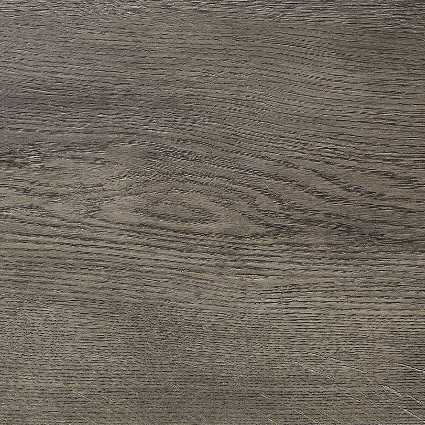
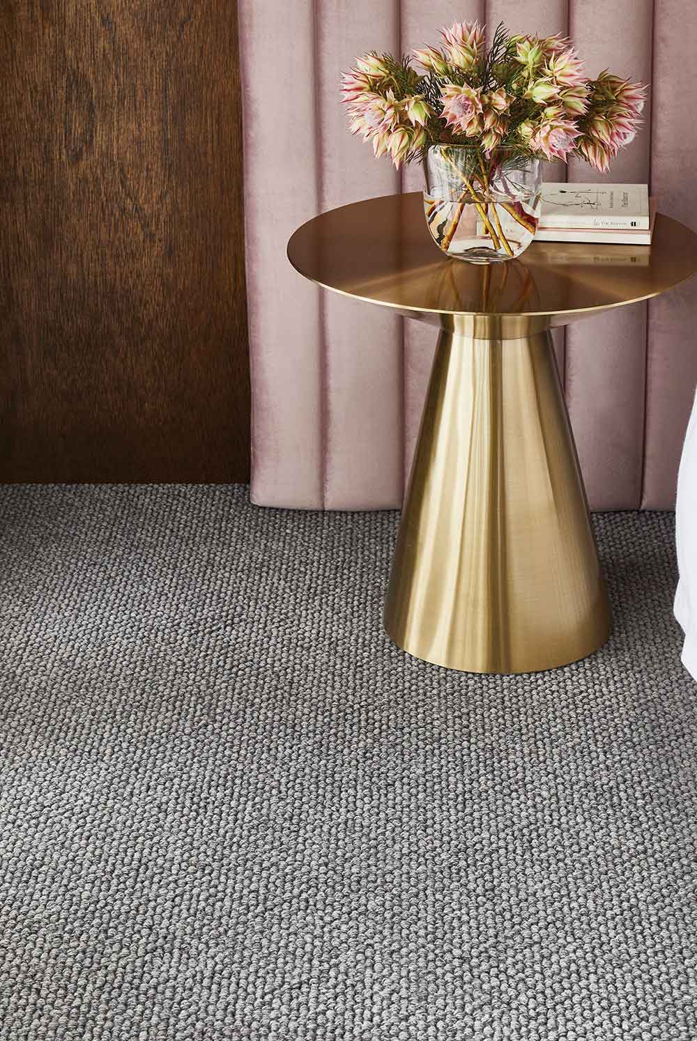
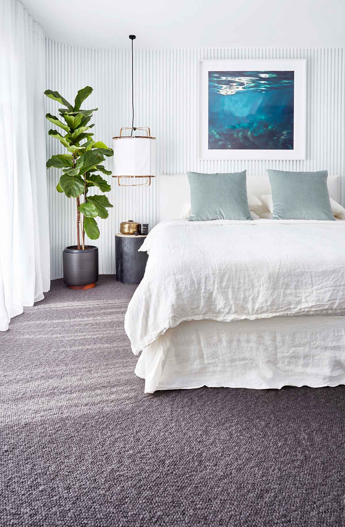
Elements of space can and should be coloured to reflect the same enriching atmosphere we experience in nature. A room realized in this way will embrace all the objects and surfaces of that space. A successful scheme will be sympathetic to the eye and evoke the strongest feelings of calmness, warmth and familiarity. This does not mean the colours need to be muted but they should complement each other. Soft greys, duck egg, silver, sea foam, slate, parchments, stone, linens and warm whites sooth and calm, offering support to all other layers required in a setting.

When picking a palette of colours for your space, stick to 3 and change the the way you use them as you move through the space. I prefer to treat my walls and floors as the canvas and then lay the colour palette from there. Warm colours tend to advance, they are energetic and enlivening, cool colours give the feeling of calmness and relaxation while white, black and grey are considered neutral.

Nature provides harmonious palettes no matter how garish they appear there is always an inherent balance. In our visual experiences harmony is something that is pleasing to the eye; that balance comes from warm and cool, light and dark. There is balance in the experience; it is neither dull nor irritating. This is what you want to achieve with your colour palette for your environment. If you have a warm grey or stoney taupe as your base colour, then look at bringing in some crisp blues and steely greys to balance the warmth. Alternatively, if you have a cool white or neutral with a greener base feel, then balance that with red based taupes and tans.

Colour evokes an emotional response as it is subjective. It can also be broken down into 3 groups – active, passive and neutral. When colouring a space think about the usage and what you personally enjoy. It’s always good to add some theory to emotion.

Red and orange represent power. They raise energy levels and come from the colours of heat, they advance and absorb, they never float. They are the colours of warmth and are invigorating and strong.

Blue symbolizes serenity, calmness and relaxation; sky blues immediately evoke wide open spaces. Soft duck egg blues offer tranquillity and peacefulness. This is a great colour for bedrooms and bathrooms. Just don’t be complacent with blue, it’s a colour that can really change a space from warm to cool. The trick is to stay away from pastel blues or clear blue, if you have that feeling that you can see through it you shouldn’t use it. Darker blues can often evoke the feeling of sadness – best not to use it as a main colour but it makes a wonderful accent and is rich and inviting when used in this form.

Yellow is a colour that floats – like sunshine, it is a compelling colour but one to watch as if used incorrectly it can appear sickening. It has been known to make babies cry and can feel fractious if the colour is too strong. It can evoke feelings of anger and frustration, but can also be cheery energizing and uplifting. Just remember to think of nature, the colours are all there they are just muted and softened, muddied and dirty as nature has not had the luxury of knowing synthetic man-made colour.

Green is the natural neutral it incorporates both the cooling agents of blue and the heat of yellow and offers a freshness that the other colours can’t give. It is the most restful colour for the eye. It is suited for any room of the home, as its calming, warm and relaxing properties relieve stress and help us relax.

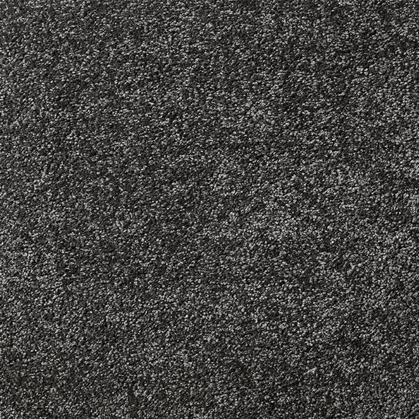
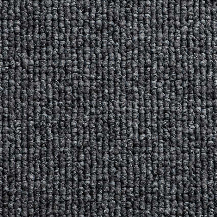
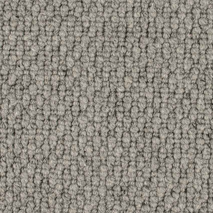
Neutrals are the decorators ‘go-to guide’. They can be considered boring and flat but if used correctly they play on light and shadow, line and form, rather than colour change. Just remember to add colour as an accent to liven things up, subtract to calm things down.

Be Styled

This year Pantone has not one but two colours of the year – Illuminating and Ultimate Gray.

A marriage of color conveying a message of strength and hopefulness that is both enduring and uplifting.

The American colour company believes that the pairing of shades will help people “fortify themselves with energy, clarity and hope” in a world that’s set to face increasing uncertainty.

Pantone Colour of the Year Quote

Illuminating is “a bright and cheerful yellow sparkling with vivacity, a warming yellow shade imbued with solar power.” Ultimate Gray, like the colors of pebbles on the beach, is emblematic of “solid and dependable elements which are everlasting and provide a firm foundation.” Ultimate Gray quietly assures, encouraging feelings of composure, steadiness and resilience.

Pantone Colour Illuminating
Image credit: Pantone.com
Pantone Colour Ultimate Gray
Image credit: Pantone.com
The selection of two independent colors highlight how different elements come together to express a message of strength and hopefulness that is both enduring and uplifting, conveying the idea that it’s not about one color or one person, it’s about more than one.

Inspiration Gallery

Find more inspo on our Pinterest board.

Karndean Korlok Natural Blackbutt
Rhino New Orleans Bourbon Street
Be Styled

The sense of touch is an important one, it provides dimension and depth to any space. Many designers call this adding “visual weight” to a space or environment. But how to do it with out overcomplicating or shifting the balance is the trick.


Much like balancing colour use with warm and cool, the same goes for texture. Rough textures provide warmth and a sense of tactical comfort, they are visually appealing and capture the eye because we inherently seek texture. Smooth textures offer urban sleekness and a modern edge. To achieve a balanced harmony, incorporate both.


Putting a smooth surface be it stone, lacquer or tile, next to a rough surface like rustic wood, long pile carpet or loosely woven textiles, will balance each other out; softening the edge of a sleek design and modernising the more rural feel of texture. Stick to two or three distinct textures in a space that is coloured so that you don’t over do the balance. If your flooring is flat and without movement – add a textured rug, pick a colour similar to the floor colour as the base of the rug colour but bring texture in through the weave or pattern don’t be afraid to use large loop pile rugs and carpets.

Take this same theory up to the furniture. Add contrast to your fabric surfaces by adding in fur or wool cushions or trim the cushions with a textured edging or raw edge thicker fabrics. Mix backs and fronts or fabrics, you don’t need to do the whole cushion in the same fabric. Often it’s a lovely look to have a more refined weave on one side and say a heavier felt or pattern on the other. Bring texture into your accents, a grouping of faux shagreen boxes against glass textured balls will lift a space by providing light as it bounces off the glass and highlights the feel of the shagreen.

Textured lamp shades work wonders in a minimal space. There are many options now that offer a mix of metals and fabrics. Look for something that has a reference to your space, be it a colour or product that is already there.

If your colour scheme is monochromatic, choose textural items that show vast contrast i.e. weaved curtains could be light in texture, almost gauze-like; mix them with strong metal rods and some heavy ties. Texture does not need to be big, it needs to add layer and stop things from becoming bored.


Be Styled

We all know of one person who just throws a whole lot of random things together and makes it work. Maybe its you? Whether its ingredients in a salad or different items of clothing. They just rock it and it works. They are probably the type of person to love the Tasteful Textures style. It’s all about bringing different elements together and making them work.


The Tasteful Textures style is a layered upon layered look. It creates softness and warmth in much the same way as you rug up and layer in winter. There’s a method to the madness; you pick a piece you like, and build your colour palette around it. It focuses on comfort, by picking materials and fabrics that add softness. Its not too “matchy matchy”. You can be a bit eclectic by bringing in variety, as long as there’s a common element to pull it together (colour, similarity of print or texture).

Here we can see the feature piece is the artwork and colours from that haven pulled out to style the rest of the space.

Why should you pick this look?

  • Textures hide a multitude of sins – we know not everyone is perfect!
  • It adds warmth to cool spaces and works well in dark spaces as it gives a rugged up feel
  • You can use what you already have, there’s no shopping necessary!
  • It provides a sense of mood – its peaceful and restful
  • The layers create luxury rather than being paired back to a more simple style
  • Works well for people with an eclectic sense of style that have a lot of elements they’d like to bring to one room
On The Floor: Nature's Oak engineered wood in Matterhorn

What does Tasteful Textures look like?

  • Knitted wools
  • Soft leathers
  • Texture, paint and wallpaper
  • Movement in the flooring using long pile or loop carpet that’s layered with rugs that are often shags
  • Burnished / worn metals
  • Organised/ purposeful mess – who thought a messy house could be stylish?! What a dream!
  • A lived in unintentional style
  • A combination of different fibers and materials – hard and soft, shiny and dull
On the Floor: Rhino Portland carpet in Oyster Shell

Does this style suit you?

Tasteful Textures is good for an older house with ‘flaws’, you can use your layers to hide things! It also helps add warmth to a drafty home.

Be Styled

Pastels are still leading summer design trends; calm, soft, relaxing, but definitely not girly.

We’re seeing earthy greens and duckegg greys teamed with warmer peaches and pinks, often mixed with navy or dark green to create a balance between masculine and feminine.

How to make pastels work

It’s about mixing shades and materials. You can pair leather and wood in grey tones and then add highlights of brighter corals, pinks and blues. Add an animal print — an ocelot carpet or skin. It’s super-masculine and comfortable and perfectly balances the softer feminine tones. Our Premium Collection Savanna Scenes range has some great fun carpets to choose from.

Floors that make pastels pop

Greys and steely metals anchor your floor and constrain the lighter colours. You can use wood and then layer with rugs in softer colours or keep the whole palette in pastel and create and airy and whimsical feel, with light wispy fabrics and blurred water colour accessories.

Here are some of our favourite floors to match with pastels – whether you’re after the wood look or the softness of carpet.

Hardfloor

Art Select Parquet Black Oak
Opus Argen
EverCore Nature Oak Noir
Impressive Saw Cut Oak Grey

Carpet

Malmo Barcelona Nou Barris Carpet
Barcelona Nou Barris
Rhino Manhattan Harlem
Manhattan Harlem
Malmo Florence 'Romito' colour swatch
Florence Romito
Salisbury 'Stone Lintel' colour swatch
Salisbury Stone Lintel
Be Styled

Do you walk into a store and often find yourself heading towards the shiny objects? Do you love copper, silver and gold tones and have a guilty pleasure for glam? Do you also love using accessories to turn ordinary into extraordinary. This is what Metal Elements is all about


The Metal Elements style allows you to bring your passion for glam into your home. It brings a sense of edgy chic style, much like putting on the fancy jewellery with your evening wear. Using metal holds a sense of strength and boldness so you can display confidence in your style.

Why should you pick this look?

The question that should be asked is why wouldn’t you?

  • It’s hard wearing, it can handle those boozy cocktail parties
  • It adds style to an affordable base – you don’t have to spend much to look on point
  • It completes your look by adding the ‘finishing touches’ (for those of you who are design conscious)
  • It can work with other styles so you can dress it up just a little bit more. Can you ever be too glam?

What does Metal Elements look like?

  • A combination of different metals in the same space add warmth. It could be as simple as hanging some silver photo frames and a popping a cooper candle holder on the table.
  • A print lover? Well its your lucky day because it works great with prints!
  • It brings monochrome schemes to life!
  • It pairs really well with a laminate or hard flooring.
  • Light or dark grey and black carpet also pairs well. Metals compliment a darker flooring really well.

Does this style suit you?
If you have a more formal living area or an apartment this look will be great for you!