Be Floored
Be Styled

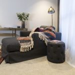
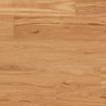
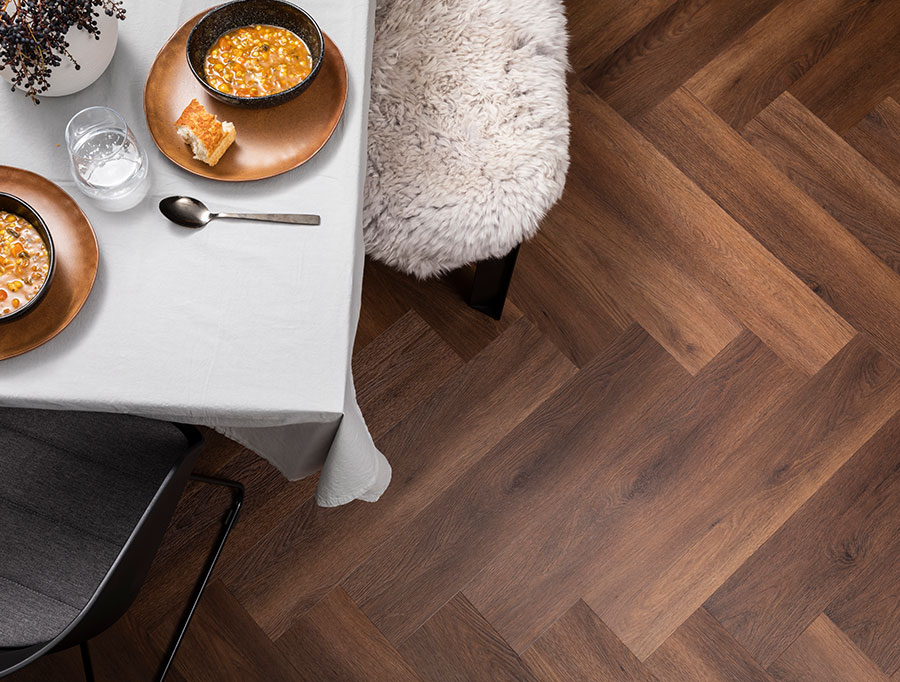
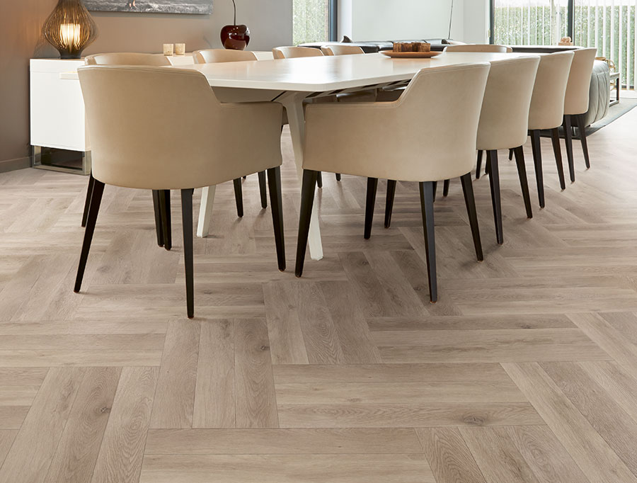
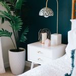
Carpet is taking on character, it’s no longer just wall to wall and flat finish; texture, weave design and edging are all playing a part in this year’s trends for carpet.

Give your floors some personality, if you don’t feel brave enough to do it wall to wall then don’t forget about carpet squares or rugs! Such a good way to inject trend or life into something that is still the foundation of your interior.

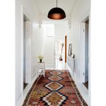
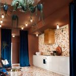
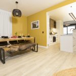
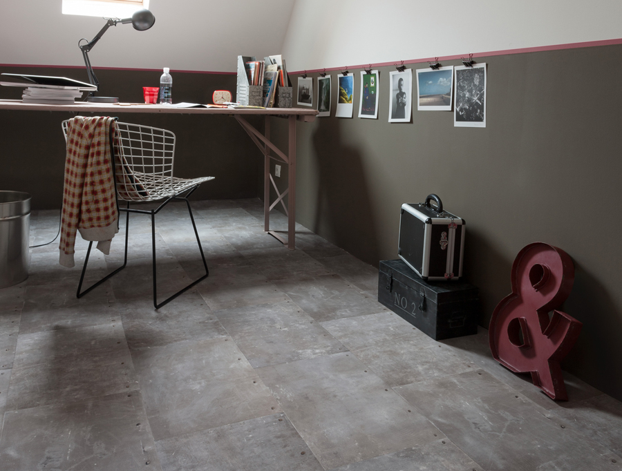
Entrance ways are packing a punch this year. You can treat this space so differently from anywhere else in your home; the entrance can be dramatic, sophisticated, opulent. Set the tone, if your home is full of neutrals and soft colours, then you could consider a deep beige or wheat colour carpet or rug with texture and pattern. Don’t dismiss jute as something to add substance, colour and weave.

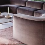
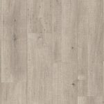
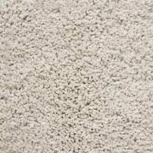
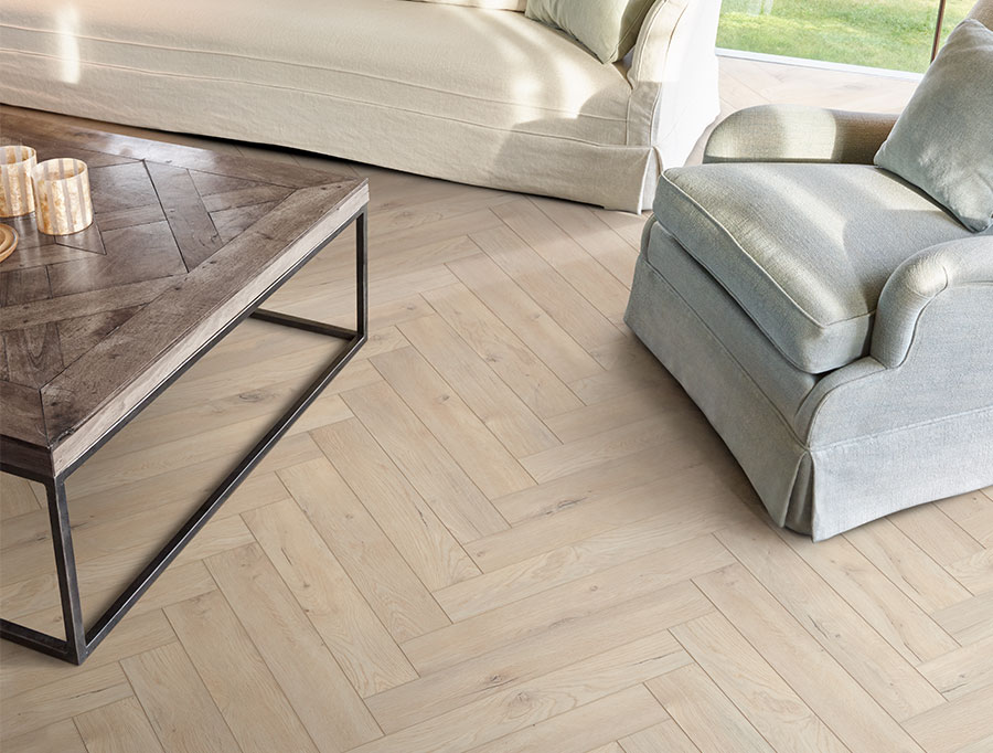
Low pile heights are popular for 2019 – easier to clean and better for moving furniture and opening doors. They also have a sleekness to them that is relevant for this season.

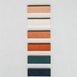
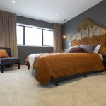
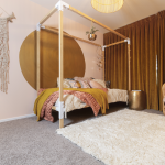
Multi-colour rugs and carpets with patterns are also on the move; blues, greens, taupe’s, and chocolates are all on point with soft organic shapes and multi textural heights.

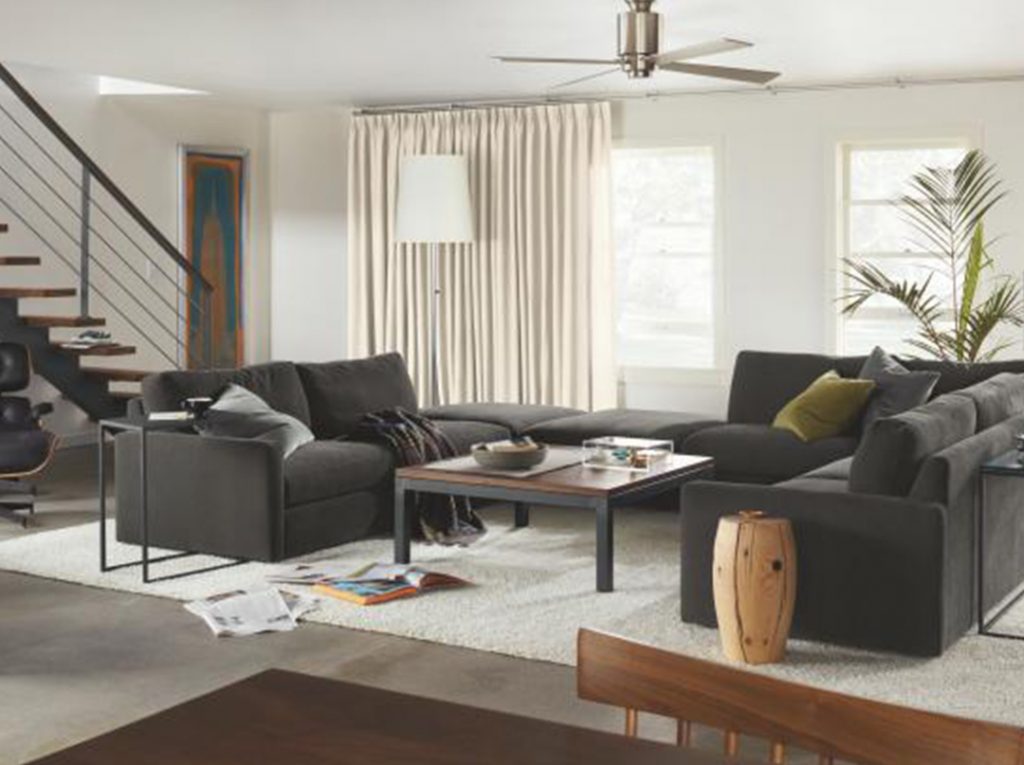
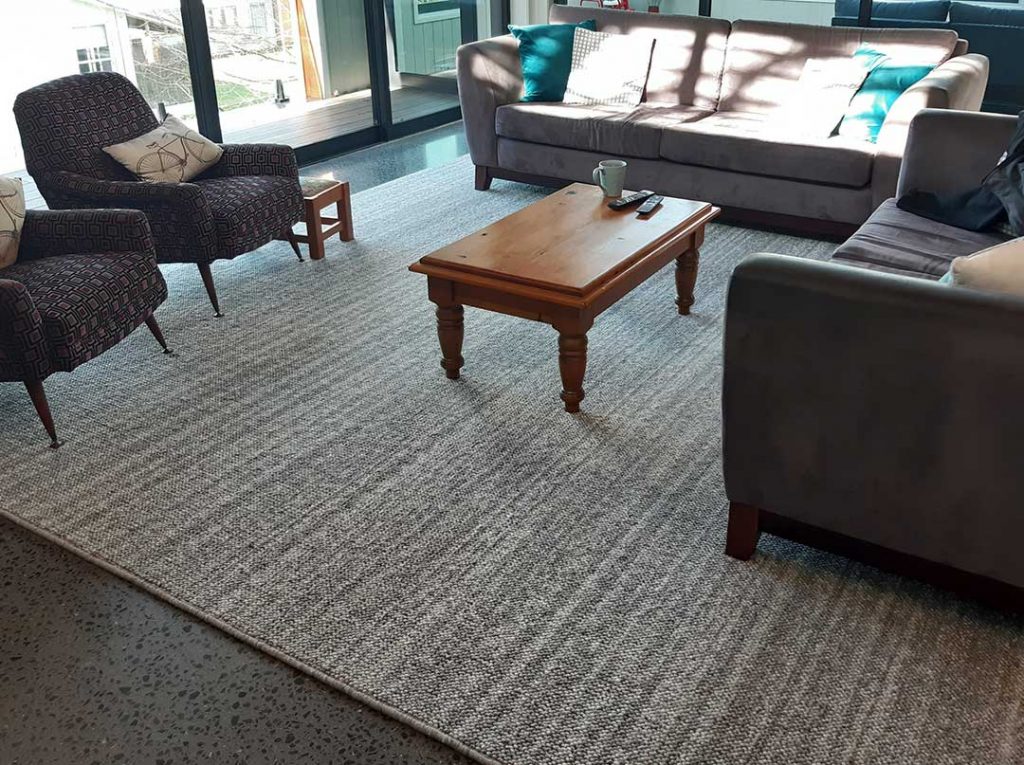
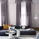
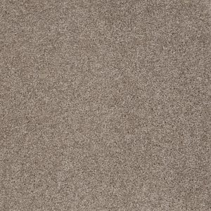
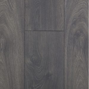
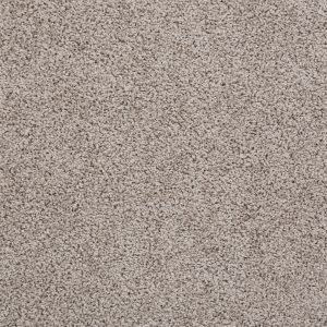
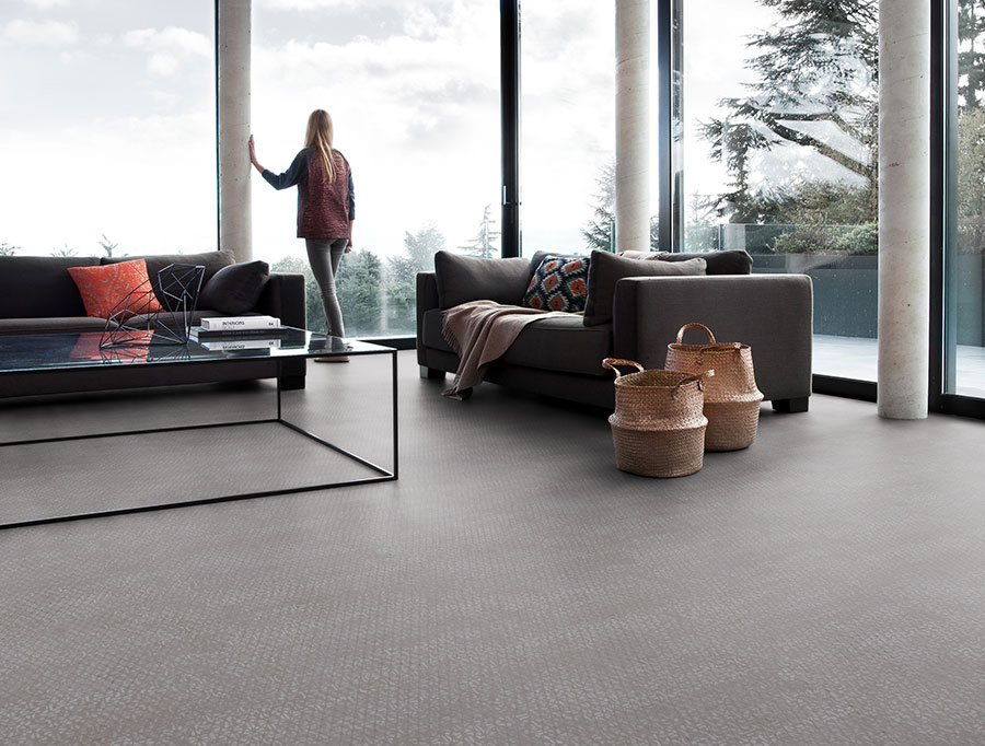
I know you have heard it before but grey is here to stay! It is still extremely popular and is such a good base colour for all palettes; but the greys of this season have developed and there’s a subtle hint of blue edging its way in.

In addition to looking chic and trendy, grey carpet sets the tone of a cool, contemporary space. It gives you a neutral backdrop for decorating in virtually any colour. Aqua, greens, bright bold colours or even black and white – they will all go with your sleek grey carpet.

If you’re wanting to redecorate for the upcoming cooler months, our friendly sales staff would love to help! Head into your local store or fill in a free measure and quote form and we will be in touch.

Be Styled

Colourphobia is on the way out! We said this for the beginning of summer and it’s here to stay; the only difference being is the tones become more saturated as the days shorten and the weather starts its inevitable turn.

Terracotta is the new kid on the block and can be seen as the link between the inside and out. It’s soft, warm, stony browns work beautifully with the navy’s and indigo’s that are coming through this winter. I’m not a great taupe or beige fan, but I have to say it is a super combination when you put these three together.

Copper is also showcasing its self this year, we have already seen a big surge of rose gold and brass metal, but copper with its red and orange tones is playing right into the earthy notes of this year’s winter palette. That’s not to say brass is gone, it’s just having to share the lime light and is competing well with a more muted, antiqued variation of what we’ve been seeing.

Forest green and saturated yellows are part of this year’s palette, just be mindful to use these as accents. Start small with colour if you are experimenting, and see how you visually react to it as it’s easier to change out a cushion that repaint every wall!

Lilac grey is a beautiful option for those who want that sophisticated hint of urban cool, but still require warmth and depth in the colour palette. The addition of lilac makes greys warmer, it’s subtle enough for you not to tire of it easily and is a great neutral for all seasons.

If you’re wanting to redecorate for the upcoming cooler months, our friendly sales staff would love to help! Head into your local store or fill in a free measure and quote form and we will be in touch.

Be Styled

Our Design Ambassador, Jane Carolan from Venia Design, tells us about an exciting new hardfloor range.

With the summer we have been having, and the hottest March on record, the doors will remain wide open and floors will still be covered with all the trappings of outdoor living for a while longer yet, and while we make the most of these sun drenched days, we can firm up new flooring decisions.

For some reason I end up with a flurry of calls at the end of summer from clients wanting advice on new flooring choices – I’m not sure if it’s because they are noticing their flooring has been thrashed over summer or if it’s the thought of seasonal change that brings on this particular cyclical trend.

If you are thinking about giving new life to your floor do not dismiss the new hard flooring from Malmo, truly giving you the best of both worlds, style and durability, something we all strive for but rarely manage to land on.

The first thing I ask my clients is “what do you want and what do you need” ….. before they understand the vast array of choices there is a pre curser of imminent sadness as they think durability will narrow their choice significantly leaving them with a fear of not being able to have want they want.

However, this is not the case and now Malmo has stepped in and given us not just one, but three hard flooring options that are stylish, timeless and very cost effective.

But how do you make the right choices to remove all of life’s challenges and protect one of your most expensive interior decisions? Review your givens; children, small and large; pets, shaggy or clawed; husbands, messy or tidy!

Your light source is also an important factor, how much light do you get and do you need to protect your flooring from it. We have exceptionally strong UV light in New Zealand that can fade and distress products but, Laminate is second to only ceramics for best fade resistance.

When reviewing durability, I can only suggest that anything natural will wear more so than something manmade – “eeek” I hear you say, “plastic and vinyl flooring should only be in a motel”.

The explosion of love towards hardwood flooring created a market for companies to develop products that are price sensitive, effective, durable and stylish and Laminate has grown in strength due to all of these reasons. Most of these new Malmo ranges have a feature called EIR which is when the embossing of the top surface of the Laminate is registered to the picture beneath giving a natural wood grain. Shine and matte finishes have also been strategically placed to give the perfectly imperfect wood-look floor.

Malmo Mammut Makro Oak Light Grey

Laminate flooring combines attractive décors, a hard wearing and scratch resistant surface on a high density core board. These man made products provide a level of durability and stability that a natural wood floor can only dream of while remaining a great option while on a budget. It’s a total solution to your wants and your needs!

The décor layer is infused in melamine to stabilize the depth of colour while the top most layer of aluminium oxide (known for its toughness) creates an extremely hard wearing finish giving peace of mind regardless of your children, pets and husbands! These are laminated to the high density core board with a final balancing layer of melamine on the bottom providing structural stability for our ever changing climate.

Mammuts extra-long boards are also extra hard, accommodating the toughest needs and have an authentic natural look and feel to them which is perfect given our love of all things texture. The colour range is spot on with a concise selection ranging from soft grey to warm natural oak which is perfectly on trend, and with a new Moisture Protection it’s certainly a more stable product than natural timber and can be laid quickly and cost effectively.

Malmo Mammut in Highland Oak Silver

If for some reason you can’t find what you are looking for in the Malmo Mammut range, then check out the Malmo Exquisit range, which is more focused on diversity and individuality offering a range of patterns and hues giving you a floor which is as natural as wood. Its comfort and warmth offers all the features we want in a wood floor and is a true representation of natural timber, comfortable and with a sense of pure solidness. The matte surface finish feels authentic and replicates a typical floor board look and feel. This is not suitable for wet areas but is extremely durable and perfect for the rest of your home. The colour selection is great for our southern hemisphere light and the range covers everything from dark and moody to urban greys and soft pines.

Malmo Exquisit in Prestige Oak Light

Laminate flooring is truly revolutionary as it’s an engineered timber at a much lower cost. The beauty is, the engineered or man-made component of the product has mitigated issues such as bowing, buckling and warping between boards and has allowed us to use it basically anywhere with confidence.

Malmo has taken the best of this European made product and selected a well thought out colour range offering all the natural components of wood strengthened with man-made technology giving us flooring solutions that fulfill both our wants and needs!

Be Styled

The proud flooring supplier of The Block on Point

House 1 – Claire & Agni

Claire and Agni went for a tone on tone flooring combo in their house. They chose to use Impressive Saw Cut Oak Grey Laminate in their kitchen, family and dining room, along with the entry, WC and laundry. This is the perfect product for splash prone areas as it is water-resistant and enables continuity throughout the home.

The carpet in their home was Rhino Portland Shadow Taupe, a beautifully soft carpet underfoot with Rhino’s Forever Clean technology making it easy maintenance for those with pets and families because of its stain resistance.

House 2 – Tom & Ben

Tom and Ben went for a strong contrasting look with the flooring in their house. They chose the very dark Malmo Nordic Storm Carpet to go in the bedrooms providing a cosy space. Malmo Nordic has a lovely thick plush feel and aesthetic at a price that won’t break the bank.

In the rest of the house they went with the light coloured Impressive White Varnished Oak Laminate, this is the ideal product for continuity throughout the home as it is water-resistant and can go in those splash prone areas like the kitchen and WC as well as everywhere else if fancy.

The strong contrast worked really well in their stylish and modern home.

House 3 – Chlo & Em

Chlo & Em also chose to go with a contrasting floor combo, though they went with a light carpet, Valour Midi Defy and dark hard flooring with Malmo Sync Chrome Arosa Oak.

Valour Midi Defy is a Cavalier Bremworth Solution Dyed Nylon. This beautiful cream colour brings a very elegant and sophisticated feel to a home. It goes well with everything and really pops next to dark hard floors, walls or furniture.

Malmo Sync Chrome is a stylish Europen Laminate that mixes satin finishes with gloss to give unprecedented 3D perspective and realism. It is family friendly, pet friendly, scratch resistant and hard wearing and comes in 8 stylish and natural look colours.

House 4 – Amy & Stu

Amy and Stu opted for a warm coloured hard floor with Korlok Natural Blackbutt in their kitchen, dining room, entry and WC and Malmo Monte Rosa Perfect Taupe Carpet in the bedrooms, study, lounge and on the stairs.

Monte Rosa is the perfect choice if you are refreshing the carpet before selling as it is well priced and great looking! Plus, comes in 9 trendy colours to choose from.

Korlok is a beautiful quality vinyl plank which takes all the best elements of a rigid core floor. It is great for a family home and is pet friendly too. It’s easy to maintain, hard wearing and water and stain resistant.

Be Styled

COLOUR

I don’t know how many times we say it but it is still true, Spring and Summer 2018 is all about bringing the outside in. Our love affair with nature and all its beauty is still on point and will forever be.

This season we will see a celebration of beautiful gentle and unusual colour combinations and an exploration of textures.

There may be tiny flashes of jewel colours, but soft and recessive collaborative tones will be an exciting new direction for not only this season but the year ahead. Mix this with the juxtaposition of the other strong colour trend POP Culture and the world of interiors is a riot.

The palette be it bright or light is holistic, a collection of gentle pastels and self-contained neutrals or bold, assured primary’s. The array of colour choice for 2019 is vast and embodies choice.

From warm whites and pale gold, to skin toned nudes, peachy tans and don’t forget blush and rose. Both muddied and warm, dusty and sleepy colours are on the Spring hit list.

Mix these soft neutral shades with crisp shades of mint, watermelon, flourishing greens, cocoa browns, shades of terracotta and Klein blue to take your spring look into the revelry of summer colour.

Inspired by the launch of Gucci’s first restaurant in Florence, The Gucci Garden, the trend adored has to be the bottle green colour scheme, most evident in the wealth of luscious fabrics on display, including velvet and silks.

Throw in a pop of gold with bottle green to create an opulent art deco ambience, perfect for the luxury home.

Greens and golds always look their best against dark wood and very crisp walls. Although we saw this tropical-inspired trend arrive towards the end 2017 it still firmly remains and is undoubtedly one of the must- have colours for your home in 2018/2019.

How we have loved Navy, but it’s time to release that strong hold and enter SAGE. Recently shared images to Pinterest show sage booming in popularity as people adopt it as a ‘new neutral’, colouring lounges and bedrooms alike, a colour that’s soft restful and akin to a warm cashmere jersey, it wraps itself around you in a nurturing way.

Credit: Jonas Ingerstedt

PATTERN

2018 will see a new trend coming straight out of the 70s. We have already got used to decorating with tiles, bold patterns, unusual shades and vintage furniture, but this year we will go for even more pronounced graphics in ceramics, in a combination of colours that we considered dull – if not ugly – before like brown and orange or mint green and grey.

Vintage 70s inspired pottery will be proudly displayed and new versions of 70s designed tiles will make our floors much more interesting and eye-catching don’t forget this can also be done in vinyl! Amazing vinyl patterned flooring is coming out of Europe and we are falling in love with it, as it’s so durable and easy to live with.

Polyflor Trento Coventry 109
Gerflor Texline Comfort 'Mandala Clear' Vinyl in Kids bedroom
Gerflor Texline Comfort Lisboa Blue
Gerflor Texline Comfort 'Lisboa Blue' Vinyl
Gerflor Texline Comfort Lisboa Blue

WALLPAPER

After suffering years of neglect and a bad reputation for being “old-fashioned”, wallpaper is back on the interior design scene with a vengeance. It is now used not only to add depth to the decor, but to create an all-new visual perspective and infuse interiors with moods and feelings. Wall coverings are taking on a role as works of art. From botanical garden or the simplest stripes on the wall. It’s a great way to add texture and design to your room.

INTERIORS

Modern Vintage has always been a popular design style but we’ve seen an increased interest in this design trend. In this age of recycling, customers like the idea of shopping for vintage items such as lighting and furniture and taking the best design styles of past eras, then merging them with modern living.

Also, no more buying furniture that is not to scale with the room. A large armchair next to a small sofa, a tiny piece of artwork above a large sprawling corner sofa can throw the whole room off – gauge your space, make sure that the pieces you choose fit the room but also fit with the other pieces around it.

This will create a cohesive effect throughout the space and provide continuity and flow.

Credit: Nordiska Kök, Kitchen Designers | Sweden

Boho Style is the 2018 interiors trend that will continue into 2019. It isn’t even really a trend – or at least not a new one. It has been around for centuries and continues to hold a special place in many hearts and homes. From top UK interior designers to intrepid and stylish hunter-gatherers, there is a renewed focus on designs from North Africa, India, South America and Malaysia. Think Raw & Refined with comfort and authentic tones, uplifting colours with a nod to botanics on every level GREEN and more GREEN from soft and natural to poppy bright emeralds! Mix these with matt black accents for a slightly boho tribal feel and embrace 2019.

In design terms we are forecasting a trend will begin to emerge that is experimental and advocates creativity. We are already starting to see that with the use of colour and texture in everything from a cushion fringe to a patterned plant.

It will embrace change, be multi-cultural, multi-coloured, multi-layered and gives you the freedom to do what you want, when you want. The colours are bright and bold, the materials are innovative in their recycling methods, the products are adaptable and the patterns are dynamic.

Experiment with colour and texture to create your own individual style.

Experiment with colour and texture to create your own individual style.

Be Styled

Malmo’s collections have been created to help inspire.

Malmo have used a local interior designer to help create different collections to inspire customers and help them visualise the look they want. These collections have been curated using different flooring styles, Resene paints, interior decor and furniture so that each look can be recreated easily.

Here’s an insight into the four collections and how you can create them for yourself at home.

Relaxed Noir

A true mix of urban colour and scandi vibes. The simplicity of the Nordic look has been given strength through layers of natural fibres and mineral colours.

Malmo Matterhorn in Foil in Bedroom

How to get the look

Strong in either colour or texture. Carpets with a woven or thicker pile will give a sense of depth. Keep floorboards wide and put the bed on a rug for layering. If using a headboard keep it simple with clean lines and square corners – plain charcoal linen can work well. Stay within the same palette of colour but reduce and increase the strength and tone of colour from wall to bedding or vice versa.

Resene Paint colour match – Half Fuscous Grey, Quarter Tapa, Black White, Athens Grey

Mid Century Chic

A sharp but not sparse take on mid-century flair. Perfect for urban living and apartment dwellings, its simple yet elegant style remains timeless and offers a lot without complication. Warm tones can be incorporated into the look with a lean towards plum and blush accents.

How to get the look

Carpets should be mid tone, donkey grey, taupes and mushroom browns. Floorboards are a mid to wide width and a less textured approach. The furniture makes the look. Leather or dark coloured fabric sofas, preferably velvet with a thin arm and leg style work best here. Don’t be sparse – this is not minimalist but is sharp. Soften it with colour.

Resene Paint colour match – Bazaar, Black Rose, Eighth Tea, Eighth Napa

Natural Living 

Reminiscent of holiday vibes, this look embraces our love of nature and indoor, outdoor flow. Floor colours should be light and slightly washed out, paired with bolder colours in walls and furniture to make a statement. Slimline wood and leather adds to the earthy, natural retreat theme.

Malmo Scandia Laminate

How to get the look

The casual nature of this look suits hardflooring. Creating a seamless sense of style, this look is not just restricted to dining rooms and can be carried throughout the whole house. Mineral colour carpets work brilliantly with this informal pared back theme. This is a great look to add a mix of modern and old as long as it’s not over layered and pieces are kept light in form.

Resene paint colour match – Balderbash, Rolling Stone, Napa, Quarter Albescent White

Urban Comfort

A soft, relaxed and uncluttered style with a lean towards urban trends. Simplicity is key with warm greys and mid browns forming the base colours. Jewelled tones in luxe fabrics complete the look.

Malmo Scandia Laminate

How to get the look

Floorboards should remain wide and with a grain as there needs to be a sense of texture but do not go rustic. Greys and mid brown walnuts work well with this trend. Metal accents in gold, brass or silver can be introduced through coffee and side tables to again add strength without clutter – keep lines thin and structured in design.

Resene paint colour match – Licorice, Prairie Sand, Double White Pointer, Alabaster

You can get a free measure and quote on all Malmo products sold at Carpet Court or you can pop into your local store and see the products for yourself.

Be Styled

Flooring is still following the trends developed and embraced over the last couple of years. Wood, LVT and Vinyl are all still strong and show a continued development of pattern and texture, not rustic but again that feeling of having a touch of something natural under foot.

Scandia LVT offers an extensive colour choice and familiarity. Gerflor, as a vinyl, offers anything from pattern to hardwood and as a waterproof option it’s extremely user friendly for the bathroom and laundry if you are on a budget but don’t want to compromise on look.

Dark wood and mid-tone to charcoal greys have returned. Gone are the light and ethereal colours we have seen for summer. This is about anchoring the palette of colour and form and providing a foundation to build on.

Herringbone and chevron made a statement last year and they’re here to stay – along with geometrical pattern in tiles and carpet squares with a throw back to the 50’s, 60’s and 70’s.

Karndean Art Select Oak Parquet Black Oak

Carpets are sitting in a slightly darker colour palette again to hold the strength of what is happening in the room – texture is still strong but not to be out done is a cut pile in a very ‘steely minerally’ grey like our Portland Silhouette. This colour works famously with the royal blues and coloured jewels we are seeing as accents.

Pair these flooring trends with the design trends from our previous Autumn/Winter Design Trends ’18 blog post and you’ll have your Winter look sorted.

Head into your local store and speak to any of our friendly sales team, they’re always wanting to help! Alternatively, fill out a free measure and quote online and we will be in touch.

Be Styled

The leaves are changing and the temperature, after all this glorious heat, is finally starting to give us a sense of what’s to come. Autumn feels some what tempestuous rather than an easing into the ambers and soft brown flurries we expect at this time of the year. The trends or expectations for this time in 2018 interiors is much the same – there seems to be a mix of riotous colour that has been tempered by the palette of nature that without fail we keep harking back to.

Everything we read is about “bringing nature inside” which is precisely what feels right, the further we move down the dehumanising technological track, the more we seem to crave the simple and magical properties of nature from colour to form. Leathers and furs still remain strong.

New Zealanders are natural globe trotters and this year its about bringing not just the nature, but the world into your home, there are no boundaries. If you review what has happened in fashion from colour to texture this year the interiors will and always do follow suit.

Moroccan jewel colours, royal blues mixed with soft blushes and faded pinks through to heavy Scotland knit, layering of luxe-like metallics with natural materials are all akin to what is happening globally. True to the current trend, it’s that inherent mix of strength and femininity that works and makes us feel comfortable and protected at the same time.

Furniture has a sway towards the glamour of the 1950’s curved lines and form set on finer leg and arm details with upholstery fabrics being crushed and textured within the weave. Velvet works beautifully for this look and not only does it add a touch of class but also warmth and depth to any interior.

Brass is still extremely relevant but its age and burnish. The sheen has been tarnished to add again, a feeling of naturalness to an element that has been used intrinsically for its sleek and gloss-like properties in the past. Again don’t be afraid to mix this with natural fibres to soften and integrate the use of metal into your space.

If you’re wanting to redecorate for the upcoming cooler months, our friendly sales staff would love to help! Head into your local store or fill in a free measure and quote form and we will be in touch.

Be Styled

We’ve been working with Leonie Barlow also known as The Style Insider over the last few months to help her transform her previous dining space into a lounge. She never used her previous space as a dining area so decided it needed a revamp. She opted for the Quickstep Majestic, Valley Oak Light Beige laminate.

We decided to do a little Q&A to find out how her experience went…

Why did you decide to renovate your dining space?

“We hardly ever used it for dining so I decided to create another lounge room instead”

Where did you source your inspiration from?

“Pinterest is the first place I look for all sorts of inspiration. I love a really clean, minimalist style and wanted to create a space that was cosy and inviting but still clean and modern looking.”

What made you decide to go with Carpet Court for your flooring?

“I’ve always gone to Carpet Court for my flooring over the years and I’ve never been disappointed which is why I always go back.”

Why did you decide to go with laminate as your flooring choice?

“Our previous flooring was also laminate and after 10 years, there wasn’t a mark on it. I love how the laminate doesn’t wear, scratch or fade and always looks amazing. The only thing that had changed was my taste and that’s why I wanted the lighter flooring.”

Was there any reason that you decided to go for lighter planks?

“I have wanted lighter planks for a few years because they suit my aesthetic which is very clean and minimal. The lighter planks also really help to make a smallish room appear much bigger which is exactly what I wanted to do with my room makeover”.

What was the installation process and how long did it take?

“Installation was surprisingly quick and easy. The first day involved uplifting the old flooring and applying a levelling compound to the wooden floor underneath to create a level surface for the new boards- this took about half a day. The second day the team was back to cut the boards to the correct lengths and lay them. So all up it took a day and a half”

What would your piece of advice to give to someone who is selecting new flooring?

“Definitely get expert advice on the right flooring for your space. You may want one thing but a different type of flooring may actually work better and last longer for your actual needs. My room is really sunny and natural wood flooring would have faded. Choosing laminate meant I would never get any fading from the sun. I wouldn’t have known this without getting some expert advice to steer me in the right direction”

Leonie has done a vlog talking through her room on her Youtube channel – The Style Insider. Check it out below.

You can also read more about her room makeover on her blog.

If you’re looking for flooring and would like some expert advice, pop into your local store and any of our friendly staff would love to help. Alternatively, you can request a free measure and quote.

You can also read more about her room makeover on her blog.

If you’re looking for flooring and would like some expert advice, pop into your local store and any of our friendly staff would love to help. Alternatively, you can request a free measure and quote.

Be Styled

Here are some of the colour trends that you can expect to see this summer. Take a look below to see if there’s one that suits you!

Resene Colours: Sakura, Gum Leaf, Clementine Orange & Point Break

Wanderlust

We all have moments, sitting behind our desk, dreaming of the next adventure or adventures past. Dream destinations may just be a plane ride away, but you can also live them every day by using that inspiration in your home. Colour makes your heart sing, just like the lively cultures we love to immerse ourselves in when we travel. Don’t be afraid to use bold saturated colours, and soften them with the likes of cool mints and powdery pinks. Get playful, don’t be afraid to use bold geometric patterns and colour blocking. Draw inspiration for your palette from artwork, get playful and create the ultimate happy space.

Resene Colours: Just Right, Organic, Rumor Has It. Flooring: Nature’s Oak Eiger

Happy Hygge

Cosiness, charm, happiness, ‘contentness’, security, familiarity, comfort, reassurance, kinship, and simpleness. It’s time to switch off the noise and drown out the negative vibes. Create space for compassion and kindness, truth and transparency. In doing so we find new joy in reviving long-held traditions and cultural influences igniting our sense of community and kinship. Celebratory cues from heritage and folklore, these earthy palettes ooz warmth and pair perfectly with calming neutrals to create a space of happiness and charm.

Resene Colours: West Coast, Innuendo, Aubergine, Rhino Wallpaper: Casamance Rive Droite from Westbury

Retrospect

The ultimate in sophistication. We’ve often stayed in the safe zone with lighter, fresher interiors; but it’s time to finally embrace those deep moody colours to add timeless elegance to our spaces. As much as we love the new and embrace modern style and technology; we’ll never be able to let go of our love of things past. Design icons will be cherished through the continued appreciation of their designs as we mix statement reproduction pieces with contemporary decor. A mash of the glamorous 70’s and a dash of the brazen 90’s this is an eclectic timeless look. Think a reunion part for the 20th century. Strong colours create a sense of intimacy; perfect for a formal lounge, social dining room or glamour bedroom. Add a touch of indulgence by incorporating luxurious textiles like velvet in opulent jewel tones mixed with precious metals accents. Keep things fresh by mixing classic furniture styles with more contemporary pieces.

Resene Colours: Mid Winter Mist, Half Mountain Mist, Bizarre, Toast Tile: Luna River Honed from European Ceramics

Elemental

Going back to basics, we all have a love of our creature comforts. It’s so easy for our modern lives to get over complicated, which this colour palette is
anything but. A growing desire to lead a more peaceful and authentic existence, has shifted focus back onto natural and re-purposed materials. Drawing inspiration from a from mother nature, this muted colour palette is
serene and nurturing. Add character to your elemental space by adding layers of differing textures. Imperfect finishes add warmth and comfort, think woven textiles with leathers and suedes, raw wood and metals on furniture. Bring some of nature inside with some indoor plant to really round it off.

Be Styled

The glory of green in all it’s shades of envy, delight and freshness has arrived.  With it’s ability to look both insipid and deep, many do not understand the complex nature of this colour. Green complements so many of the colours we see around us, it supports and encourages other colours to perform.

This is a trend that needs depth and solidness to make it shine, carpets and wood need to have a sense of foundation to play, walnuts and chocolate browns, sooty greys and deep donkey taupes work extremely well. Remember a trend is just that it will pass; and for that very reason think of this current colour as an accent which you can change out, but your flooring and other foundation pieces will need to stay. Darker pieces of furniture are on the rise again – we will see plenty of richer and darker tones, mix this with the lighter more emerald style greens and the wood will glow.

If you are still in the mood for metal the colour of brass is hot on the heels of bronze and a perfect fit for greens of any shade. There is also the rise of terracotta, earthware is making a come back but keep it in a matt finish and as an accent to add warmth and depth to your environment. A great way to bring the outside in or create a different feel for your outdoor room, mix this with a tribal rug and some beautiful plants and your urban jungle begins.